How I Added Character to Our Open Concept Living & Dining Room
- Apr 9
- 11 min read
Over the past year, I’ve been slowly transforming our formal living and dining rooms from builder-basic into some of the most photographed spaces in our home—even landing a feature in a national ad campaign! As the first rooms you see when entering our home, I wanted them to make a strong first impression.

Before we get into the transformation, let me take you back to where it all started—and how this large, open space evolved into the cozy, welcoming rooms they are today.
The History
We bought our home in August 2021, and it was brand new—such an exciting moment for us! It’s a spec home (built without a specific buyer), but we purchased it during the framing stage, which gave me the opportunity to choose a few key finishes, including the cabinetry colour, lighting fixtures, and kitchen backsplash tile.

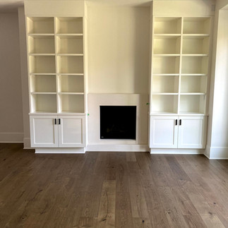
One upgrade we chose to add—and invest in—was the built-in cabinetry surrounding the living room fireplace. Here are a few photos from the first time we toured the completed house, before taking possession.

The grin says it all—I had spent months watching the progress from the outside, so finally seeing it all come together was so exciting!
While the built-ins came with a hefty price tag, I have zero regrets. As you can see below, they create a true focal point in our formal living room—the very first space you see when entering our home.

Fun fact: a few years later, we rented our home to Urban Barn for a product photoshoot, and our living room built-ins were featured in their national advertising campaign. It was such a surreal moment flipping through the pages of Style at Home and spotting our space in print!


The Before
When we first moved in, these two rooms sat empty for several months while I figured out a furniture plan and saved money to execute my vision.


I started with the living room, bringing in a beautiful blue velvet sofa, two accent chairs, side tables, and an area rug. The coffee table, however, took some time to figure out—I tested a couple of ottomans and even borrowed a table from a friend before landing on something more permanent. I also incorporated an antique dresser I’ve had since my 20s, which holds a lot of sentimental value, and tucked it into the corner of the room. Here are some photos of how the space looked when I first decorated it (notice to 2 different ottoman options)


In the dining room, I bought a new dining table, some chairs from IKEA and used the hutch from our previous home as well as a black metal table I had on hand. The only artwork I had on display were some prints from our previous home that were not my favourite, but acted as a place holder.


Now you might be thinking "Kerri these rooms look great, why did they need a makeover?" and when I look at these beautiful photos captured by professional interior photographer Tracey Ayton, I was thinking the same thing! Both of these rooms were off to a really great start, but as a Designer who uses her home as her design laboratory, I wanted to push the styling even farther! Also, after living with this furniture setup for a few years, I began to notice a few things that weren’t quite working, so I decided to make some changes.
While all of the initial decorating was fine…there was room for improvement, here were the "itch factors" that I wanted to address:
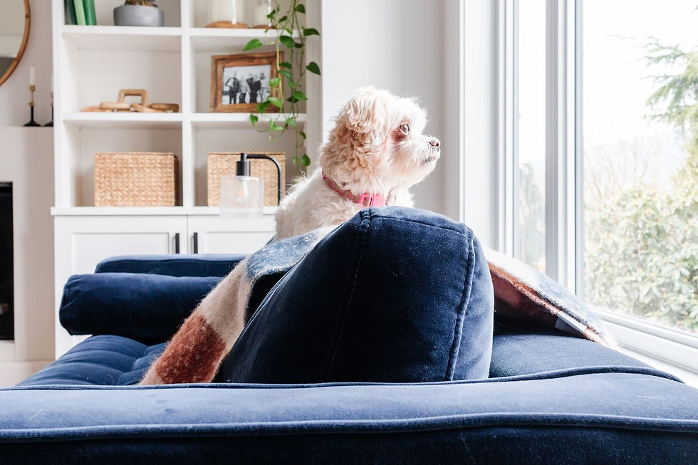
The sofa situation
As much as I loved the blue velvet sofa, it quickly became the dogs’ favourite spot to nap. Despite my best efforts to keep the dogs off of this beautiful sofa, the battle between Ginger and I over her not being allowed on this sofa was a losing one for me.... and a source of GREAT entertainment for the rest of the family “ha ha, Ginger’s on the blue couch again mom!!

The other thing that was happening was that the light from the huge window was fading the back of the sofa.
The layout challenges
That sentimental antique dresser wasn’t functioning well in the space. While the room looks large with its tall ceilings, the layout is surprisingly tricky. The dresser crowded the accent chairs and disrupted the flow between the living and dining areas.

The dining room
The tall black hutch in the dining room looked beautiful, but it wasn’t practical. When hosting, we lacked proper surface space for food and serving.

A sideboard felt like a better solution—and conveniently, the hutch found a perfect new home in the kitchen.
photo
With that move, though, we were left with a dining room that was starting to feel like a big white box. While the living room had a strong focal point with the built-ins, the dining room felt stark in comparison. Like many spec homes, it had great bones—but it lacked warmth, personality, and character. The plain white walls just weren’t doing the space any favours.

The Inspiration & Planning
After identifying what wasn't working and where I wanted to introduce some bigger design elements, I created a list of goals for the space, and came up with this list:
Create a space were we can host family friends that is cozy, calming and visually interesting
Improve functionality with a low-stress sofa option and a sideboard for the dining room
Improve flow by removing the vintage dresser
Give the walls, especially in the dining room, some visual interst (wallpaper/trimwork/artwork/open shelving)
Add warmth and colour
I started collecting images and ideas and put together a design plan. I am always inspired by Shea McGee and her timeless approach to modern- traditional style, so her website was a big source of inspiration.
Here are some images I collected:


I noticed a few common threads in the images I saved: black furniture pieces, open shelving, wood wall detailing, and wallpaper.
Around that same time, Chris Loves Julia revealed their newly wallpapered dining room—complete with painted casings and baseboards—and I was completely obsessed.

For a while, I seriously considered wallpaper. I ordered samples and had them taped up on the wall for months, but in the end, I just couldn’t make it work within my budget. Wallpaper is beautiful—but between the cost of materials and installation for such a large space… it adds up quickly. Once I let go of that idea, I shifted my focus to paint and wood detailing.
In my office, I had previously added board and batten to one wall and painted the room Sherwin-Williams Unusual Gray—a colour I still love years later. It has just the right amount of depth, warmth, and softness while still reading as neutral. The trim work adds character and gives the space a more timeless, collected feel—less “builder basic,” and more like it has always been there.
That became my direction for the living and dining rooms.

I decided to use the same paint colour throughout and introduce wood detailing to the dining room walls to add interest and depth. After exploring different options on Pinterest, I landed on picture molding as the perfect solution.

The Design Plan
Once I had a clear direction, I pulled everything together into detailed design boards for each space, which I will share with you below.
Before purchasing anything, I like to gather as many elements as possible—furniture, lighting, textiles, and finishes—and arrange them visually. This helps me see how everything will work together and ensures the final space feels cohesive. Because this is an open concept layout, it was also important for me to look at both rooms side by side.

I compared the design boards to make sure the materials, tones, and styling elements flowed seamlessly from one space to the next. Another important part of my process was working with a mix of what I already owned and what I planned to bring in. Rather than starting from scratch, I kept key pieces that were working (for example our dining table and living room accent chairs) and built around them—making thoughtful updates where needed to improve both function and overall cohesion.
Living Room Design Board
For the living room, I kept the existing accent chairs and built the plan around them, while introducing a new sofa, rug, coffee table, lighting, and artwork. Seeing everything together ahead of time helped me create a balanced mix of old and new.

Dining Room Design Board
In the dining room, I kept the existing table, swapped in chairs from the kitchen, and layered in new pieces like a rug, sideboard, wall shelf, bar cart, and updated artwork. This board helped me visualize how to add character while still working with pieces I already had.

Blending existing pieces with new ones not only helped manage the budget, but also made the space feel more layered and lived-in.
The Transformation
The power of paint
It’s amazing how much a single paint colour can completely change the feel of a space. Before making any furniture or styling changes, I started with the element that would have the biggest impact across both areas: paint.
I chose to use Sherwin-Williams Unusual Gray—a colour I already knew and loved. It brings warmth and depth while still reading as a soft, livable neutral.
Because the rooms are open to one another, using the same paint throughout helps everything feel connected and intentional. It also creates the perfect backdrop for the other design elements to really shine.
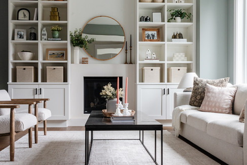
The Living Room
With a clear plan in place, I started making changes to the living room—focusing on improving both functionality and overall cohesion.
Before:

After:
The Sofa Swap
The biggest change in this space was replacing the blue velvet sofa. I decided to purchase a budget-friendly sofa from IKEA, knowing that it was going to be a favourite nap destination for our dogs. With a durable, washable and replaceable sofa cover in a soft grey fabric, this was the most practical option. I also happen to like the clean lines of this sofa and the colour. I have used it in several spaces and am always happy with it.

Improving the Layout
Next, I removed the vintage dresser from the corner of the room. As much as I loved it for sentimental reasons, the dresser was crowding the accent chairs and interrupting the flow between the living and dining areas.
Before:

After:
Once it was gone, the room immediately felt more open and easier to move through—proof that sometimes less really is more.
Wall Decor
Once I removed the dresser from the corner, the artwork hanging above into longer worked. Without a piece of furniture for visual interest, I decided to hang a gallery wall of favourite art prints, and then install a picture light above it. I have often admired this configuration and was excited to have the wall space to give this a try. The coolest part of this installation is that I avoided the cost and hassle of having to hire an electrician by choosing a battery operated picture light! I love this fixture and feel like it deserves it’s own blog post!

Grounding the Space
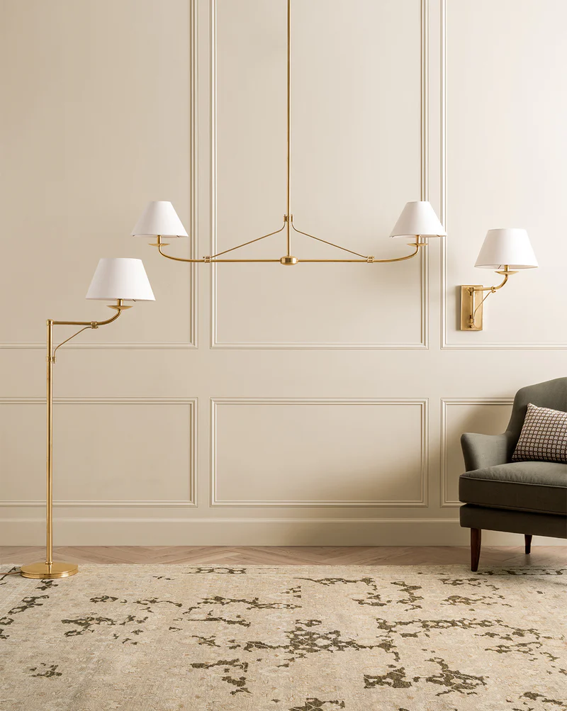
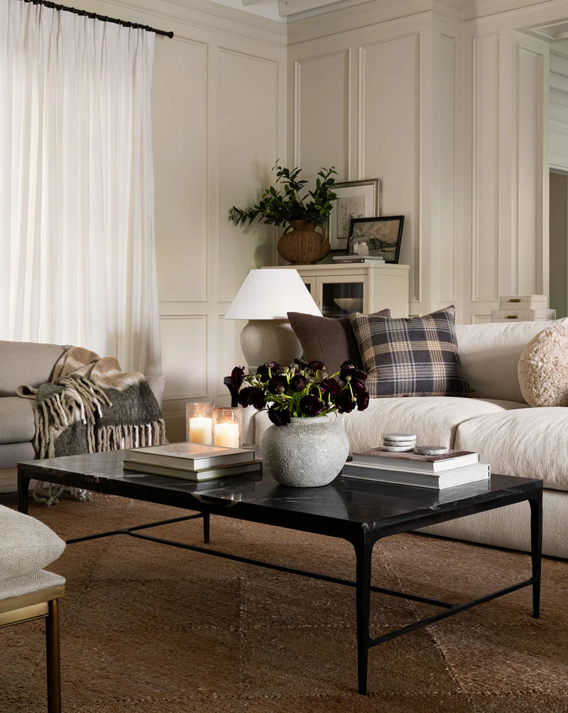
I brought in a new rug and coffee table to help ground the space and create a more cohesive look. Because the living and dining rooms are so closely connected, it was important that the rugs worked together rather than competing. I chose a more neutral, solid rug for the living room, which allowed me to go bolder with colour and pattern in the dining room.

I also loved the idea of incorporating a black coffee table as a grounding element. It acts as a strong visual anchor in the space while subtly tying in the black furniture pieces used in the dining room—helping both areas feel connected and cohesive.

The end result is a living room that feels both stylish and livable. It still highlights the built-ins as the main focal point, but now the surrounding elements support that feature rather than compete with it. More importantly, it’s a space that truly works for our everyday life—dogs included.
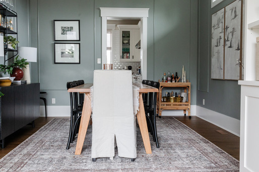
Dining Room Transformation
With a design plan in place, it was time to turn my design board into reality. It was exciting to see my ideas come to life in the space, let's review the key details that made the biggest impact.
Adding Architectural Detail
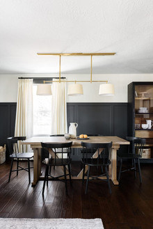
The biggest transformation in this space came from the addition of picture molding.

The dining room had been feeling flat and a bit stark, especially in contrast to the living room’s built-ins. Adding this trim work instantly brought depth, interest, and a more custom, elevated feel to the space. It gave the room that “collected over time” look, rather than feeling like a blank builder-grade box. I painted the picture molding the same colour as the walls, but went with a semi-gloss finish. Such a simple addition yet it adds so much the room….almost as good as wallpaper!

Making a Statement with Art
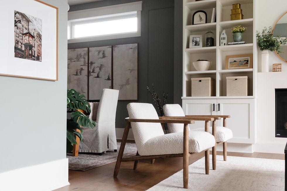
To complement the picture molding, I incorporated large-scale artwork on the wall adjacent to the built-ins. The larger scale helps ground the dining area and adds personality, while the neutral colour palette adds interest without competing with the built-ins.

Creating Contrast with Dining Chairs
One of the simplest but most impactful changes was swapping in the black dining chairs from our kitchen, while keeping two slipcovered chairs on the ends of the table.

This added contrast and helped tie in the black sideboard. It also created a more cohesive flow between the spaces, especially when paired with the black accents carried through the living room.
Layering with Textiles
With the dining room feeling quite neutral and wallpaper no longer an option, I turned to the rug as a way to introduce colour and pattern. In an open concept space, a rug also plays an important role in defining each area. It helps visually separate the dining room from the living room while still allowing both spaces to feel connected.

Because there are very few textiles in this room, the rug became an especially important design element. I was intentional in choosing something with enough pattern and colour to add depth and personality without overwhelming the space.
As a designer—and a mom—I also knew durability mattered. In a dining room, spills are inevitable, so I always recommend a performance rug that’s easy to clean. Low-pile, polyester options are especially practical, and choosing a patterned design helps disguise everyday wear and the occasional mishap.

The rug I selected incorporates subtle green tones that mirror the wall colour, creating a cohesive, layered look that ties everything together—while also giving me peace of mind when it comes to everyday use.
Improving Function with a Sideboard
Replacing the tall hutch with a sideboard was a game-changer for both function and flow.
Before:
After:

Not only does it provide a much more practical surface for hosting, but its lower profile keeps the space feeling open and balanced.
Styling with Open Shelving & Bar Cart
Above the sideboard, I added a wall-mounted shelf to create an opportunity for some styling as well as a place to showcase my glassware collection. I had so much fun styling this and even more fun photographing it to capture the items on display.


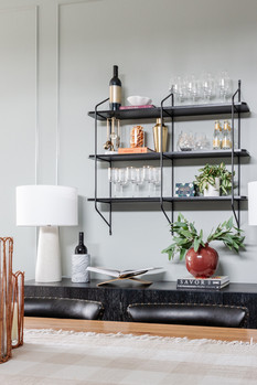
There are two rather empty corners in the dining room, and a bar cart moment added function and personality to the room. Together, these elements help the room feel more complete, lived-in, and ready for entertaining.

The Finished Spaces
After all of the planning, decision-making, and layering, these spaces have completely transformed from a blank, builder-basic starting point into rooms that feel warm, inviting, and full of character.


What I love most is how cohesive everything feels. Even though the living and dining rooms each have their own identity, they flow seamlessly together and feel connected as a whole.
Design Takeaways
This transformation didn’t happen overnight—it evolved over time through thoughtful updates and intentional choices. And in the end, that’s what made it feel truly personal.

This space is a reminder that you don’t need to do everything at once. Starting with a plan, working with what you have, and layering in changes over time can completely transform how a home looks and feels.
If you need help refreshing or pulling together a room in your home, check out our decorating consultation options by clicking here:
Thanks for reading about our living and dining room transformation! If you like this post, and want more inspiration, follow me on instagram and sign up for my monthly newsletter!
Kerri


I've been exploring AI-powered presentation tools, and this AI presentation maker has been a pleasant surprise. It makes creating professional slides, visualizations, and presentations much faster and easier. I also found their guides on poster powerpoint design and how to make slideshow techniques quite helpful for improving presentation quality. The platform seems well-suited for students, professionals, and content creators who want to save time while producing engaging PPTs. Has anyone else used Havi? I'd be interested in hearing about your experience and results.
Love it!!!!! Beautiful job!!!!